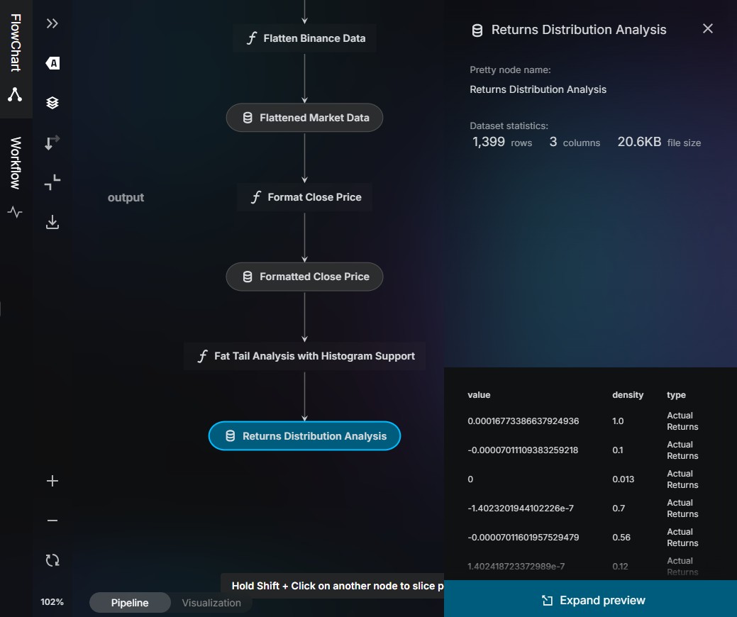
Explore NVEIL's Capabilities Discover interactive visualizations, powerful data transforms, and color palettes — all generated from your data with a simple prompt.
Powered by Plotly, deck.gl, VTK, force-graph, Kedro, and more
Gallery Data Toolkit Palettes
Visualization Types Every type is fully tweakable and multiple visualizations can be combined together. Many are available in both 2D and 3D variants.
comparison composition correlation distribution financial flow geographic hierarchy multivariate network spatial surface trend volumetric
Electronics Clothing Food Books Home Sports Toys 0 10k 20k 30k 40k
Bar Chart comparison
Compare categories with proportional bars.
Show revenue by product category, sorted descending
Jan Feb Mar Apr May Jun Jul Aug Sep Oct Nov Dec 10k 15k 20k 25k
Line Chart trend
Reveal trends over time with connected series.
Plot monthly sales for the last 24 months
20 30 40 50 60 40k 60k 80k 100k 120k
30 40 50 60
Scatter Plot correlation
Spot correlations and clusters in (x, y) space.
Scatter plot of Age vs Income, color by Region
Histogram distribution
See the shape of a distribution at a glance.
Histogram of exam scores with 30 bins
Box Plot distribution
Compare distributions across groups.
Box plots of salary by department
Violin Plot distribution
Combine density estimation with box plot summaries.
Violin plot of salary distribution by department
Sector / Pie Chart composition
Show parts of a whole as proportional slices.
Pie chart of market share by vendor
Candlestick Chart financial trend
Track price movements with open-high-low-close bars.
Candlestick chart of stock prices over 3 months
Surface Visualization (2D Area & 3D Surface) spatial surface
Interactive 3D surfaces from scattered data.
Generate a smooth elevation surface from (x,y,z)
Heatmap (Unigrid) spatial
Color-coded grid revealing spatial patterns.
Heatmap of temperature over longitude/latitude
Contour Plot spatial
Iso-lines connecting equal-value regions.
Contour plot of elevation data with filled regions
Geographical Map geographic spatial
Heatmaps, scatter points, choropleths, and more on interactive maps.
Choropleth map of population density by country
Graph network
Explore relationships as node-link networks.
Build a collaboration graph colored by department
Sankey Diagram flow
Visualize flows and quantities between stages.
Sankey diagram of energy production to consumption
Parallel Coordinates multivariate
Compare many dimensions on parallel axes.
Parallel coordinates of car specs colored by MPG
Treemap / Partition hierarchy composition
Show hierarchical data as nested rectangles.
Treemap of company headcount by department and team
Vector Field spatial flow
Arrows and streamlines showing direction and magnitude.
Show wind velocity as a vector field with streamlines
Volumetric Rendering volumetric spatial
Render 3D scalar fields with transfer functions.
Render a CT volume emphasizing bone structures And so much more... These are just a few examples. Every visualization is hand-crafted with precision — describe what you need and NVEIL will build it from your data.
Data Toolkit 50+ data transforms you can invoke by simply describing what you need. The AI selects and chains them automatically.
Color Palettes Sort:A→Z Z→A # Colors ↑ # Colors ↓ Tags: anatomical bold colorblind friendly diverging medical mono pastel
Discrete
COLORBREWER PAIRED
bold
12 Colors #a6cee3 #1f78b4 #b2df8a #33a02c #fb9a99 #e31a1c #fdbf6f #ff7f00 +4
HC DEFAULT
pastel
10 Colors #7cb5ec #434348 #90ed7d #f7a35c #8085e9 #f15c80 #e4d354 #8085e8 +2
HUE CIRCLE
19 Colors #1ba3c6 #2cb5c0 #30bcad #21b087 #33a65c #57a337 #a2b627 #d5bb21 +11
RDBU
bold diverging
9 Colors #b2182b #d6604d #f4a582 #fddbc7 #f7f7f7 #d1e5f0 #92c5de #4393c3 +1
TABLEAU 20
pastel
20 Colors #4e79a7 #a0cbe8 #f28e2b #ffbe7d #59a14f #8cd17d #b6992d #f1ce63 +12
VAPORWAVE
pastel
11 Colors #20de8b #ccde8b #ffde8b #ffa88b #ff6a8b #ff6ad5 #c874aa #c774e7 +3
Continuous
CLASSIC BLUE
256 Colors #b4d4da #b3d4da #b2d3da #b0d3db #afd3db #aed3db #add2db #acd2db +248
CT AAA
medical anatomical
64 Colors #00000000 #05030100 #0a060300 #0e080400 #130b0600 #180e0700 #1d110900 #22130a00 +56
CT AIR
medical anatomical
64 Colors #ffffffb4 #f6ffffb4 #ecffffb4 #e3ffffb4 #daffffb4 #d1ffffb5 #c7ffffb5 #beffffb5 +56
CT BONE
medical anatomical
64 Colors #00000000 #06020200 #0c040500 #12060700 #18080a00 #1e0a0c00 #240d0f00 #2a0f1100 +56
CT CARDIAC3
medical anatomical
64 Colors #00000000 #00020800 #00041100 #00061900 #00082200 #000b2a00 #000d3200 #000f3b00 +56
CT CHEST CONTRAST ENHANCED
medical anatomical
64 Colors #00000000 #04020100 #09040200 #0d060400 #12080500 #160a0600 #1a0c0700 #1f0e0800 +56
CT CHEST VESSELS
medical anatomical
64 Colors #00000000 #08040200 #10070400 #170b0600 #1f0e0800 #27120b00 #2f150d00 #36190f00 +56
CT CORONARY ARTERIES
medical anatomical
64 Colors #00000000 #00000000 #00000000 #00000000 #00000000 #00000000 #00000000 #00000000 +56
CT CORONARY ARTERIES 2
medical anatomical
64 Colors #00000000 #00000000 #00000000 #00000000 #00000000 #00000000 #00000000 #00000000 +56
CT CROPPED VOLUME BONE
medical anatomical
64 Colors #00000000 #00000000 #00000000 #00000000 #00000000 #00000000 #00000000 #00000000 +56
CT FAT
medical anatomical
64 Colors #4c4cff00 #4c63e900 #4c79d200 #4c8fbc00 #4ca6a600 #4cbc9000 #4cd27900 #4ce86300 +56
CT LIVER VASCULATURE
medical anatomical
64 Colors #00000000 #00000000 #00000000 #00000000 #00000000 #00000000 #00000000 #00000000 +56
CT LUNG
medical anatomical
64 Colors #4c4cff00 #4141ff00 #3535ff00 #2929ff00 #1d1dff00 #1111ff00 #0505ff00 #136f7b26 +56
CT MIP
medical anatomical
64 Colors #00000000 #0a0a0a00 #15151500 #1f1f1f00 #29292900 #34343400 #3e3e3e00 #48484800 +56
CT MUSCLE
medical anatomical
64 Colors #00000000 #05020100 #09040300 #0e060400 #13090500 #180b0600 #1c0d0800 #210f0900 +56
CT PULMONARY ARTERIES
medical anatomical
64 Colors #00000000 #00000000 #00000000 #00000000 #00000000 #00000000 #00000000 #00000000 +56
CT SOFT TISSUE
medical anatomical
64 Colors #00000000 #00000000 #00000000 #00000000 #00000000 #00000000 #00000000 #00000000 +56
MRI PRESET 1
anatomical
255 Colors #00000000 #09000000 #11000000 #1a000000 #23000000 #2b000000 #38080408 #440f0810 +247
RDBU CONTINUOUS
bold diverging
256 Colors #611300 #641400 #671500 #6a1600 #6d1700 #6f1800 #721900 #751a00 +248
SPECTRAL
bold
256 Colors #a71b4b #a91e4b #ab204a #ad224a #ae244a #b02649 #b22949 #b42b49 +248
SUNSET SUNRISE DIVERGING
pastel
256 Colors #33608c #36608d #3a618d #3d618e #40618e #43618f #45628f #486290 +248
VIRIDIS PLASMA
colorblind friendly
256 Colors #0d0887 #100788 #130789 #16078a #19068c #1b068d #1d068e #20068f +248
VIRIDIS STD
colorblind friendly
256 Colors #440154 #440256 #450457 #450559 #46075a #46085c #460a5d #460b5e +248